Responsive Website Design
Laddermat needed updating to a responsive website design. KeaKreative were happy to help. When they came to us requiring substantial updates on their old website. We created their old website quite a few years ago and it was starting to look dated as the internet is a fast moving and developing place! We looked into updating the look and functionality and took a fresh look at Laddermat’s goals for their website. With the client agreeing that an update was the best idea, we set about making a sparkly, new, modern responsive website design for them.
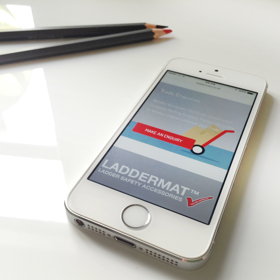
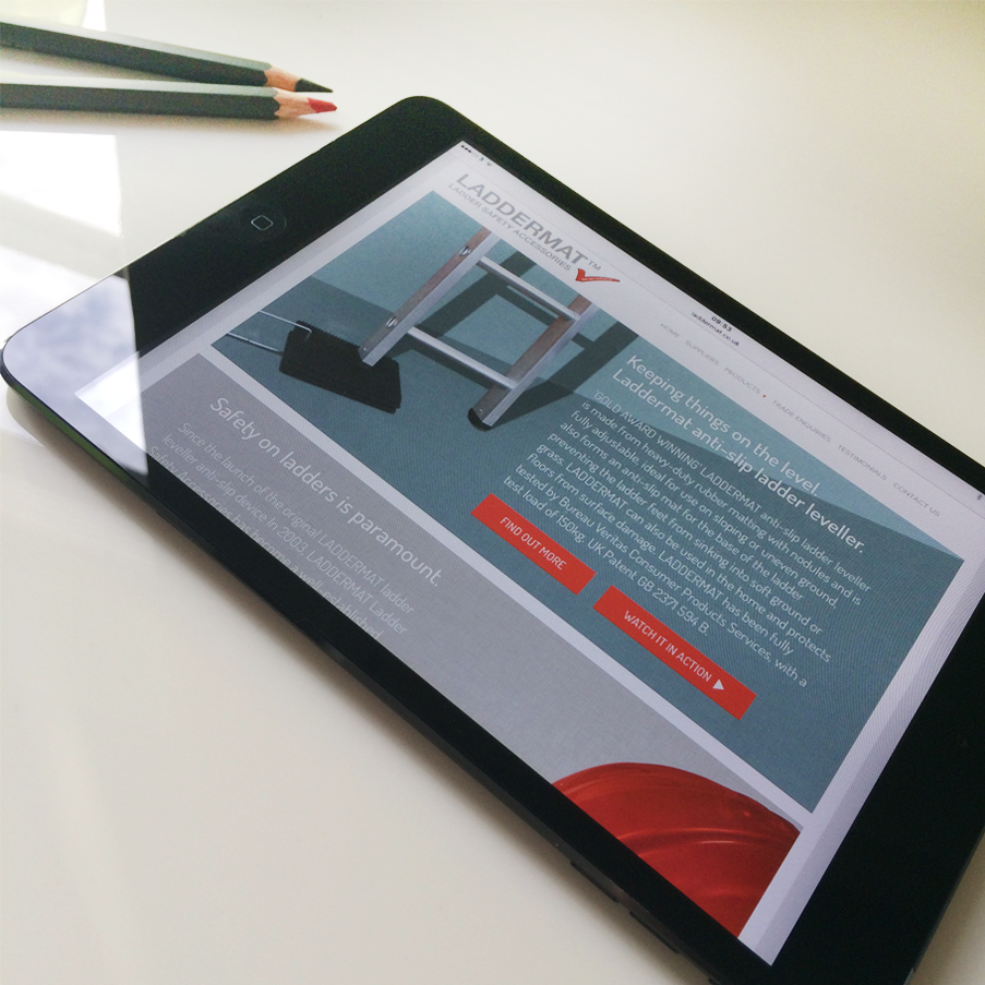
Keeping the original logo supplied by the client, we refreshed the look and feel of the site with the key focus being on the product and encouraging the visitors to the site to get in touch and make an enquiry. A mobile device friendly website is key these days, with so many people browsing and researching products on their phones or tablets. Google also gives preference to a responsive website so it puts you one step ahead of your competitors if they are not running a device friendly website design.
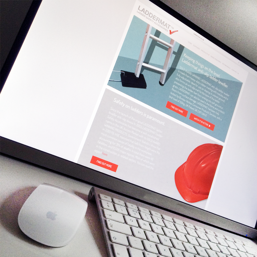
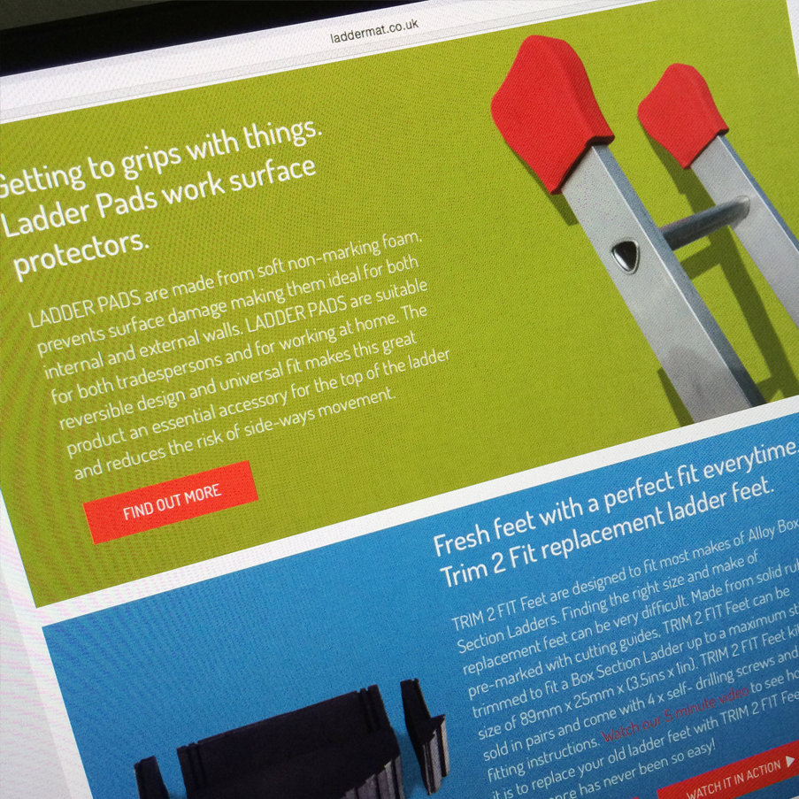
This was a fun website to design, incorporating real images of the products, removing the backgrounds using Photoshop, and inserting nice textured colour backgrounds to make the products ‘pop’ off the page. We also loved creating the graphic illustration of the sack barrow for the Trade Enquiry area. It’s not the most exciting subject but it is an amazing product and quirky little illustrations make a website more appealing.