Logo and Branding Design Felixstowe
Ink Again Felixstowe are a ink refill shop based in Felixstowe, Suffolk. Who required a logo and branding identity to use throughout their company literature. They came to us after we initially offered advice on a name for their new business on a local business group. From this we helped create the logo and branding design and this led onto a website and shop front design which was aimed mainly at local people to help them locate the shop and discover their services.
![]()
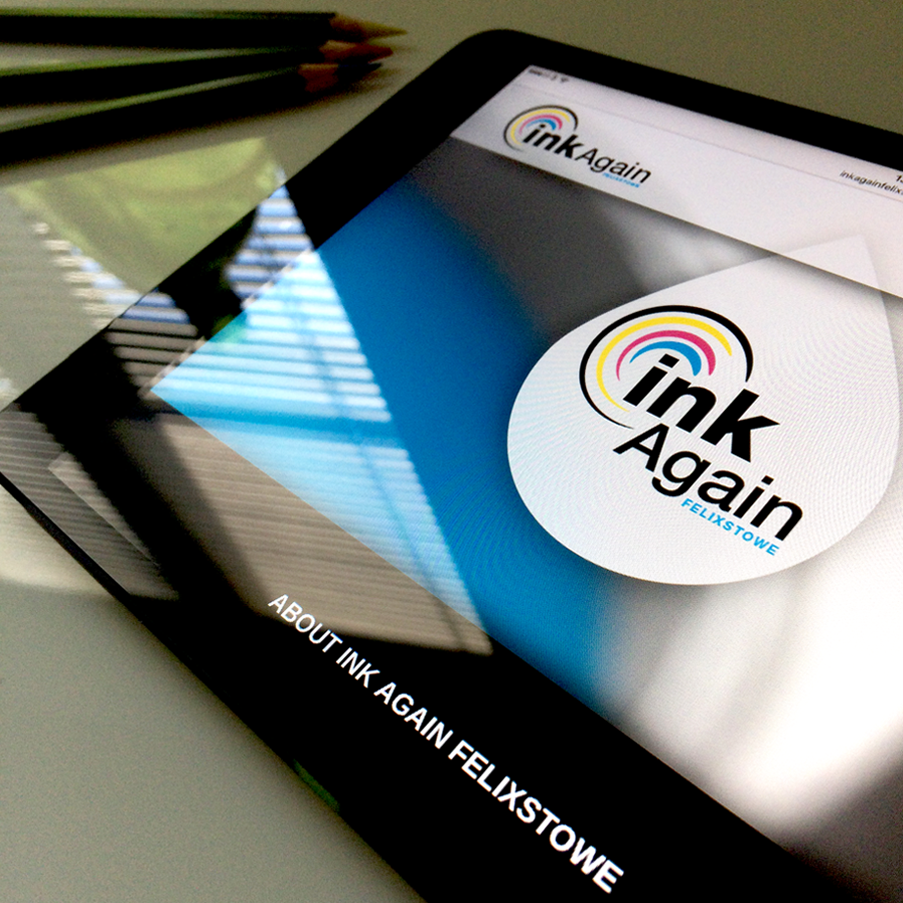
The logo itself shows the standard ink colours, cyan, magenta, yellow and black. All of these swirled over to offer an idea of recycling and a circle to ecompass the word ink suggesting ink and all things related. The wording ‘Ink Again’ came about from use inks again, recycle and also the saying ‘Think Again’ before you buy new inks. Their branding is carried out through all aspects of their designs using the brand colours.
![]()
![]()
Initially there were only three icons on the website but since then our client has added numerous new services to their list. Adding new icons was always the intention and we took this into consideration with the initial website design, always offering room for expansion. The icons spin on the desktop version of the site to add a bit of fun and life to the design. Once clicked it cleverly anchors to the box below with an explaination of the service.
We carried over Ink Again Felixstowe’s branding to their Facebook page, creating a quick simple header graphic and an icon style version of their logo.