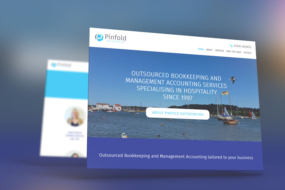
Pinfold Outsourcing Company Logo Design Melton
Pinfold Outsourcing, based in Melton approached KeaKreative to create them a strong, established looking logo to represent their business that has been running since 1997.
![]()
Using the initials “P” and “O” with the graphic icon it can be used as a standalone, recognisable icon graphic when/if required in social media etc.
The light grey represents professionalism, strength and reliability. The blue represents security, trust and knowledge. Using the division of colours to represent a balance. We used a bold modern font with a light version too to give a traditional, established look but with fresh style so as not to look outdated from the start.
When we create logo designs for our clients we often don’t give too much away with our reasonings for the designs, we think it is important that first impressions count to the client, we give a brief description and then discuss the selected logo design further often divulging our reasons for colour, layout and font selections.
Once we created the logo and solidified the fonts, colours etc we were asked to create their website design head over and read about that if you’d like to know more about the company brand.