Logo and brand design for Orwell Computers
Amazing Mac repair logo and brand design for Orwell Computers. This covers so many of my loves in one graphic, logo design, Apple, gadgetry and repairing things!
![]()
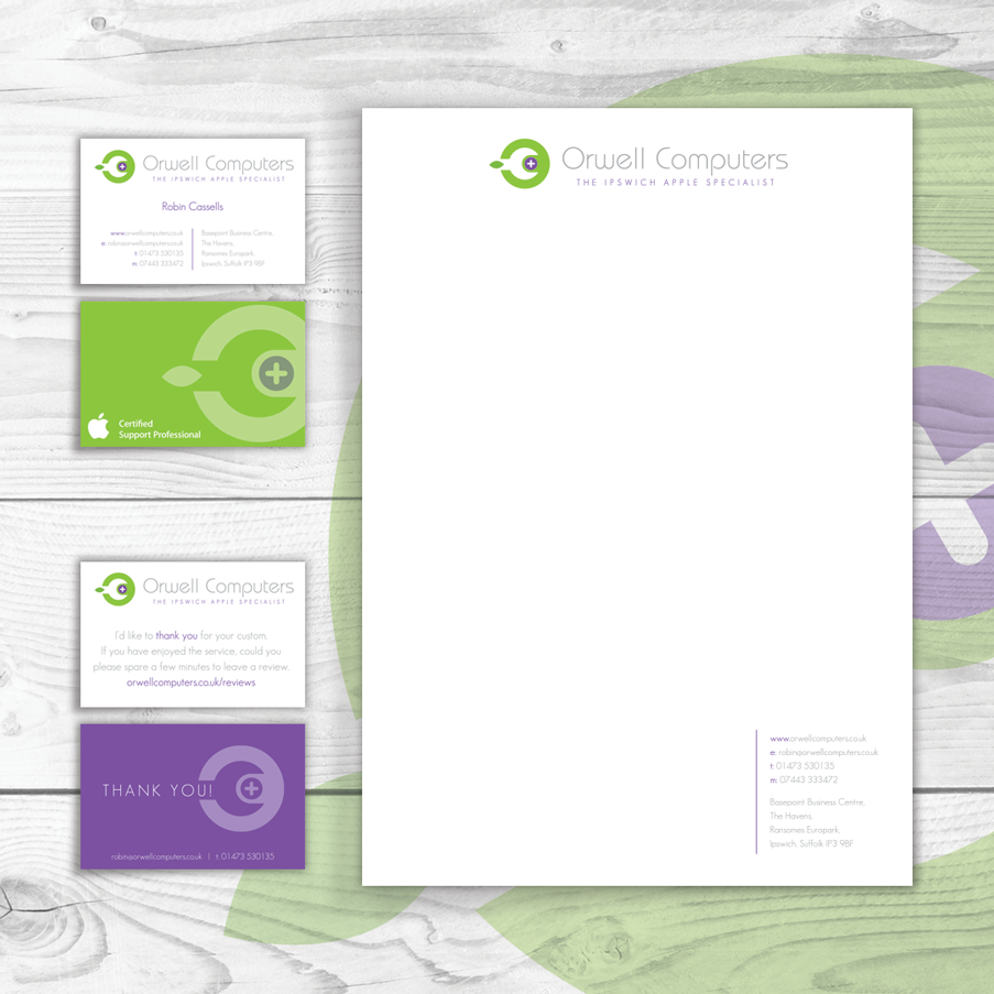
The logo and brand design is clean, sharp and Apple-esque without being too ‘Apple’. We managed to incorporate the initials O and C into the brand logo design graphics, with the ‘O’ being in the green circle and the ‘C’ being in the head of the spanner tool. The Spanner creates a ‘C’ and also symbolises repair on a universal basis. The ‘+’ symbol is used for Pharmacies, Hospitals it’s a ‘Positive’ sign and it’s also used through out the Mac OS so it will be recognised and related to by Apple product users hopefully. The leaf is again Apple-esque shows regeneration and creates a link and recognition to Apple without being ‘too Apple’.
Colours mean so much when it comes to logo and brand design.
Purple: Giving a logo a feeling of royalty, trust, strength, quality although it can give the impression of opulence which may give the impression of expensive but our client doesn’t use cheap parts as it is not in their best interests to use budget parts on high end computers.
Green: Symbolises health, life and the environment. Also related to healing. Using this in conjunction with the Apple style leaf we think it says ‘repair’ and
‘renew’ not just throw away and get a new one, doing your bit for the environment. Research has also shown that the colour Green makes people happy to
part with their money.
People react to colours in different ways but there’s certainly a direct relation between certain companies brands and their colours. Fast food chains using predominantly Reds and Yellows for example.
Once the logo and branding was finalised we set to work creating the stationery design.